1、CSS 层叠样式表
Cascading style sheets
1.1、语法规则
选择器 {
    属性名: 属性值;
}
1.2、书写位置
head 标签中的 style 标签中
css注释为 / /
<head>
    <title></title>

    <style>
        /* 这里写css */
    </style>
<head>
1.3、CSS 引入方式
| 引入方式 | 书写位置 | 作用范围 | 使用场景 |
|---|---|---|---|
| 内嵌式 | style 标签 | 当前页面 | 小案例 |
| 外链式 | link 标签引入单独 css 文件 | 多个页面 | 项目中 |
| 行内式 | 标签 style 属性中 | 当前标签 | 配合 js 使用 |
(1)内嵌式
- CSS 写在 style 标签中
- style 标签可以写在页面任意位置,一般放在 head 标签中
<!DOCTYPE html>
<html lang="en">

<head>
    <meta charset="UTF-8">
    <meta http-equiv="X-UA-Compatible" content="IE=edge">
    <meta name="viewport" content="width=device-width, initial-scale=1.0">
    <title>Document</title>
    <style>
        p {
            /* 这里是注释,快捷键ctrl + /  */
            /* 文字颜色设置为红色 */
            color: red;
            /* 字体大小设置为30像素 */
            font-size: 30px;
            /* 背景颜色 */
            background-color: green;
            /* 设置宽度和高度 */
            width: 600px;
            height: 100px;
            line-height: 100px;
            text-align: center;
        }
    </style>
</head>
<body>
    <p>文字</p>
</body>
</html>
(2)外链式
- CSS 写在单独的
.css文件中 - 通过 link 标签引入到网页中
<!DOCTYPE html>
<html lang="en">
<head>
	/*link:css*/
    <link rel="stylesheet" href="./css-2.css">
</head>
<body>
    <p>文字</p>
</body>
</html>
(3)行内式
- CSS 写在标签 style 属性中
<div style="color: green; background-color: #f1f1f1;">
  文字
</div>
1.4、基础选择器
- 标签选择器
- 类选择器
- id 选择器
- 通配符选择器
(1)标签选择器
格式:
标签选择器会选择所有相同标签
标签名 {
    属性名:属性值;
}
举例:
<style>
    p {
        color: red;
    }
</style>
<p>你好</p>
(2)类选择器
格式:
.类名{
    属性名:属性值;
}- 合法的类名:数字、字母、下划线、中划线
- 一个元素可以有多个类名,空格隔开
举例:
<style>
    .red {
        color: red;
    }

    .size {
        font-size: 60px;
    }
</style>

<div class="red">你好</div>
<div class="red size">世界</div>
(3)id 选择器
#元素id{
    属性名:属性值;
}- 页面中唯一,不能重复
- 一个标签只能有一个 id
- id 选择器一般与 js 配合使用
举例:
<style>
    #name {
        color: green;
    }
</style>

<div id="name">你好</div>
(4)通配符选择器
*{
   属性名:属性值;
}- 选中页面所有标签
- 一般用于统一设置页面样式
/* 清除内外边距 */
* {
  margin: 0;
  padding: 0;
  box-sizing: border-box;
}
2、CSS 字体和文本样式
样式的层叠问题:给同一个标签设置相同的样式,此时样式会层叠(覆盖),写在最下面的会生效
所谓层叠即叠加,样式一层一层层叠覆盖
2.1、字体大小
浏览器默认字体大小 16px
修改字体大小:font-size
/* 浏览器默认字体大小 16px */
<div style="font-size: 16px;">Hello World!</div>
<div style="font-size: 26px;">Hello World!</div>
2.2、字体粗细
font-weigh
数值为100~900的整百数
font-weight: 400;| 属性值 | 数值 | 效果 |
|---|---|---|
| normal | 400 | 正常 |
| bold | 700 | 加粗 |
<div style="font-weight: normal">Hello World!</div>
<div style="font-weight: bold">Hello World!</div>
注意:不是所有字体都提供了九种粗细,因此部分取值页面中无变化。
实际开发中以:正常、加粗两种取值使用最多
2.3、字体样式
font-style
font-style: normal;| 属性值 | 效果 |
|---|---|
| normal | 正常 |
| italic | 倾斜 |
<div style="font-style: normal;">Hello World!</div>
<div style="font-style: italic;">Hello World!</div>
2.4、字体系列
font-family
/* 优先使用:微软雅黑 > 黑体 */
/* 如果客户端都没有这些字体就选择一种无衬线字体 */
font-family: 微软雅黑, 黑体, sans-serif;| 操作系统 | 默认字体 |
|---|---|
| windows | 微软雅黑 |
| Mac | PingFang SC |
常见字体系列
| 常见字体系列 | 特点 | 场景 | 该系列常见字体 |
|---|---|---|---|
| 无衬线字体(sans-serif) | 文字笔画粗细均匀,并且首尾无装饰 | 网页 | 黑体、Arial |
| 衬线字体(serif) | 文字笔画粗细不均匀,并且首尾有装饰 | 报刊书籍 | 宋体、Times New Roman |
| 等宽字体(monospace) | 每个字母或文字的宽度相等 | 程序代码编写 | Consolas、 fira Code |
<div style="font-family: 微软雅黑, 黑体, sans-serif;">Hello World!</div>
<div style="font-family: 宋体, Times New Roman, serif;">Hello World!</div>
<div style="font-family: Consolas, fira Code, monospace;">Hello World!</div>
2.5、文本缩进
text-indent
/* 首行缩进2个字符 */
text-indent: 2em;
取值
- 数字 + px
- 数字 + em (推荐:1em=当前标签的 font-size 大小)
<p>Hello World!</p>
<p style="text-indent: 2em;">Hello World!</p>
2.6、文本水平对齐(内容对齐)方式
text-align(内容居中,针对字标签的内容进行居中)
可以用text-align居中的内容标签:(inline-block,inline)
文本、span、a、input、img
text-align: center;
text-align: left;
text-align: right;| 属性值 | 效果 |
|---|---|
| left | 左对齐(默认) |
| center | 居中对齐 |
| right | 右对齐 |
内容居中需要给 父元素 设置居中属性
<p>Hello World!</p>
<p style="text-align: center;">Hello World!</p>
2.7、文本修饰
清除a标签默认下划线:
/* 常用于清除a标签默认下划线 */
text-decoration: none;| 属性值 | 效果 |
|---|---|
| underline | 下划线 |
| line-through | 删除线 |
| overline | 上划线 |
| none | 无 |
<p style="text-decoration: none;">Hello World!</p>
<p style="text-decoration: underline;">Hello World!</p>
<p style="text-decoration: line-through;">Hello World!</p>
<p style="text-decoration: overline;">Hello World!</p>
2.8、行高
line-height
/*字号的1倍*/
line-height: 1;
line-height: 50px;
文本高度 = 上间距 + 文本高度 + 下间距
line-height 取值:
数字 + px
倍数(当前标签 font-size 的倍数,即不算上下间距的倍数)
常用应用方式:
单行文本垂直居中:line-height=元素父元素高度
取消上下间距:line-height=1
<p style="line-height: 1">Hello World!</p>
<p style="line-height: 1.5;">Hello World!</p>
<p style="line-height: 3;">Hello World!</p>
2.9、font 属性简写(复合属性)
复合属性:
font: style weight size/lh 字体 分先后顺序
只能省略前面两个,如果省略了相当于设置默认值
若要同时设置单独和连写模式:单独写在连写下面(层叠)
/*font: style weight size 字体*/
font: [font-style font-weight] font-size/line-height font-family;
在线配置 font 简写-形式
https://developer.mozilla.org/en-US/docs/Web/CSS/font#live_sample
h2 {
    font: italic 700 60px 宋体
}
h3 {
    /*倾斜 加粗 66像素 2倍行高 宋体*/
	font: italic 700 66px/2 宋体
}

<h2>font ez</h2>
<h3>font ez</h2>关于Chrome调试工具:f12打开,选择元素,左边为html,右边为css3,css3样式可以通过键盘方向键修改,TAB键新增样式
查看网页源代码:ctrl+u 或者右键网页 查看源代码
2.10、颜色取值
- 文字颜色 color
- 背景颜色 background-color
| 颜色表示方式 | 表示含义 | 属性值 |
|---|---|---|
| 关键词 | 预定义的颜色名 | red、green、blue |
| rbg 表示法 | 红绿蓝三原色,取值 0-255 | rgb(0,0,0) |
| rgba 表示法 | 红绿蓝三原色+透明度,取值 0-1 | rgba(0, 0, 0, 0.5) |
| 十六进制表示法 | #开头,数字转换为16进制 | #ff0000 简写 #f00 |
<p style="color: green;">Hello World!</p>
<p style="color: rgb(0, 255, 0);">Hello World!</p>
<p style="color: rgba(0, 255, 0, 0.5);">Hello World!</p>
<p style="color: #00FF00;">Hello World!</p>
<p style="color: #0F0;">Hello World!</p>
2.11、水平居中
margin
margin: 0 auto; /*上下不动,左右居中*/div、p、h(大盒子) 需要设置元素的宽度,否则会自动撑满父元素
<style>
div {
    width: 300px;
    height: 400px;
    background-color: skyblue;
    margin: 0 auto;
}
</style>

<div></div>
3、CSS 选择器进阶
3.1、后代选择器
后代选择器,即后代,儿子,孙子,重孙子...都会被选中
格式:
父选择器 后代选择器: {
}
选择器可以是标签、类、id......等选择器
示例:
<style>
    div span {
        color: green;
    }
    .A .B {
        color: blue;
    }
</style>

<div class="A">
    <span>Hello World!</span>
    <p class="B">
        <span>Hello World!</span>
    </p>
</div>
3.2、子代选择器
只会选中儿子
格式:
父选择器 > 子代选择器: { }示例:
<style>
    div>span {
        color: green;
    }
</style>

<div>
    <span>Hello World!</span>
    <p>
        <span>Hello World!</span>
    </p>
</div>
3.3、并集选择器
格式:
选择器1, 选择器2: {
}
示例:
代码规范:多个选择器,空格后回车
<style>
    p,
    span {
        color: green;
    }
</style>

<div>
    <span>Hello World!</span>
    <p>Hello World!</p>
</div>
3.4、交集选择器
交集选择器是找两个或多个选择器的交集
格式:
选择器1选择器2: { }示例:
p.box{
	color: red
}

/*找到第一个p,带box类的*/
<p class="box"></p>
<p>ppppp</p>
<div class="box"></div>
3.4、相邻兄弟选择器
相邻兄弟选择器是用来选取某个元素紧邻的兄弟元素,它的语法是 "选择器A + 选择器B"
h1+p{
    margin-top:20px;
    color:black;
}
3.5、通用兄弟选择器
通用兄弟选择器和相邻兄弟选择器很相似,它的语法是"选择器A ~ 选择器B",会匹配选择器A后面所有符合选择器B的元素
H1~P{
    color:red
}
3.6、:hover 伪类选择器
作用:鼠标悬停在元素上的样式
任何标签都可以添加伪类,任何一个标签都可以鼠标悬停
格式:
选择器:hover {
}
示例:
<style>
    p:hover {
        color: green;
    }
</style>

<div>
    <p>Hello World!</p>
    <span>Hello World!</span>
</div>
3.7、结构伪类选择器
- 作用:根据元素在 HTML 中的(父子)结构关系查找元素
- 优势:减少对 HTML 中类的依赖,有利于保持代码整洁
- 场景:常用于查找某父级选择器中的子元素
| 选择器 | 说明 |
|---|---|
| E:first-child | 父元素中的第一个子元素 E |
| E:last-child | 父元素中的最后一个子元素 E |
| E:nth-child(n) | 父元素中的第 n 个子元素 E |
| E:nth-last-child(n) | 父元素中的倒数第 n 个子元素 E |
n 可以写公式
n 可取值:0 1 2 3 4...
| 功能 | 公式 |
|---|---|
| 偶数 | 2n、even |
| 奇数 | 2n+1、2n-1、odd |
| 找到前 5 个 | -n+5 |
| 找到从第 5 个往后 | n+5 |
示例:
<style>
    ul li {
        background-color: #ccc;
        width: 200px;
    }

    ul li:first-child {
        background-color: red;
    }

    ul li:last-child {
        background-color: yellow;
    }

    ul li:nth-child(3) {
        background-color: pink;
    }
</style>

<!-- ul>li{第$个li}*8 -->
<ul>
    <li>第1个li</li>
    <li>第2个li</li>
    <li>第3个li</li>
    <li>第4个li</li>
    <li>第5个li</li>
    <li>第6个li</li>
    <li>第7个li</li>
    <li>第8个li</li>
</ul>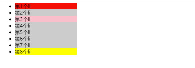
3.8、伪元素
- 元素:HTML 标签
- 伪元素:CSS 模拟出标签效果,装饰性内容
| 作用 | 伪元素 |
|---|---|
| 在父元素内容的最前添加一个伪元素 | ::before |
| 在父元素内容的最后添加一个伪元素 | ::after |
注意点:
- 必须设置 content 属性才能生效
- 伪元素默认是行内元素,宽高不生效
.box::before {
  content: ''; // 必须加属性
}
3.9、:focus 伪类选择器
:focus表示获得焦点的元素(如表单输入)。当用户点击或触摸元素或通过键盘的“tab”键选择它时会被触发。
<input class="red-input" value="I'll be red when focused."><br>
.red-input:focus {
  background: yellow;
  color: red;
}
3.10、:checked 伪类选择器
任何处于选中状态的radio,checkbox 或 ("select") 元素中的option HTML 元素 ("option")。
/* 匹配任意被勾选/选中的 radio(单选按钮),checkbox(复选框),或者 option(select 中的一项) */
:checked {
  margin-left: 25px;
  border: 1px solid blue;
}
3.11、属性选择器
CSS 属性选择器 匹配那些具有特定属性或属性值的元素。(常配合 自定义属性 使用)
/* 存在 title 属性的 <a> 元素 */
a[title] {
  color: purple;
}

/* 存在 href 属性并且属性值匹配"https://example.org"的 <a> 元素 */
a[href="https://example.org"] {
  color: green;
}

/* 存在 href 属性并且属性值包含"example"的 <a> 元素 */
a[href*="example"] {
  font-size: 2em;
}

/* 存在 href 属性并且属性值结尾是".org"的 <a> 元素 */
a[href$=".org"] {
  font-style: italic;
}

/* 存在 class 属性并且属性值包含单词"logo"的<a>元素 */
a[class~="logo"] {
  padding: 2px;
}
4、Emmet 语法
- 简写语法,快速生成代码
- VS Code 等代码编辑器自带
| 语法 | 示例 | 效果 |
|---|---|---|
| 标签名 | div | <div></div> |
| 类选择器 | .red | <div class="red"></div> |
| id 选择器 | #one | <div id="one"></div> |
| 交集选择器 | p.red#one | <p class="red" id="one"></p> |
| 子代选择器 | ul>li | <ul><li></li></ul> |
| 内部文本 | ul>li | <ul><li>Hello</li></ul> |
| 创建多个 | ul>li*3 | <ul><li></li><li></li><li></li></ul> |
| 创建自增 | ul>li{$}*3 | <ul><li>1</li><li>2</li><li>3</li></ul> |
| 同级 | div+p | <div></div><p></p> |
css 提示
| 单词首字母 | 效果 |
|---|---|
| fw | font-weight |
| w | width |
| h | height |
| bgc | backgroud-color |
| lh | line-height |
| w300+h200 | width: 300px;height: 200px; |
5、CSS 背景相关属性
5.1、背景颜色
background-color
Emment:gbc
默认背景色是透明;背景色在背景图之下
transparent:透明
/* 默认背景色是透明;背景色在背景图之下*/
background-color: transparent;/*透明*/
5.2、背景图片
background-image
Emment:bgi
background-image: url(路径);示例:
<style>
    .box {
        width: 100%;
        /* 元素必须给一个尺寸才能显示背景图 */
        height: 500px;
        background-image: url(./XXX.jpg);
    }
</style>

<div class="box"></div>
5.3、背景平铺
background-repeat
Emment:bgr
| 取值 | 效果 |
|---|---|
| repeat | (默认值)水平和垂直方向都平铺 |
| no-repeat | (最常用)不平铺 |
| repeat-x | 水平方向平铺(x 轴) |
| repeat-y | 垂直方向平铺(y 轴) |
示例:
<style>
    .box {
        width: 100%;
        /* 元素必须给一个尺寸才能显示背景图 */
        height: 500px;
        background-image: url(./XXX.jpg);
        background-repeat: no-repeat;
    }
</style>

<div class="box"></div>
5.4、背景位置
background-position
Emment:bgp
background-position: 水平方向位置 垂直方向位置;
属性值
方位名词(最多只能表示 9 个位置)
水平方向:left center right
垂直方向:top center bottom
数字+px(坐标)
坐标轴 原点(0,0) 盒子的左上角
x 轴 水平方向
y 轴 垂直方向
图片左上角与坐标原点重合
示例:
<style>
    .box {
        width: 100%;
        /* 元素必须给一个尺寸才能显示背景图 */
        height: 500px;
        background-image: url(./XXX.jpg);
        background-repeat: no-repeat;
        /*background-position: center;*/
        /*background-position: 50px -50px;*/
        background-position: center; /*水平垂直都居中可以简写*/
    }
</style>

<div class="box"></div>
注意:正数:向右向下移动,负数:向左向右移动
背景色和背景图只显示在盒子里面
5.5、背景属性连写
background
Emment:bg
格式:
不分先后顺序
对于position:背景图位置如果是英文单词可以颠倒顺序
测试背景图位置如果是数值 不能颠倒顺序
/* 不分先后顺序 */
background: color image repeat position;
示例:
<style>
    .box {
        width: 100%;
        /* 元素必须给一个尺寸才能显示背景图 */
        height: 500px;
        /*
        两种写法等价
        background-color: #fff;
        background-image: url(./XXX.jpg);
        background-repeat: no-repeat;
        background-position: center bottom;
        */
        background: #fff url(./XXX.jpg) no-repeat center bottom;
    }
</style>

<div class="box"></div>Copy to clipboardErrorCopied
5.6、img 标签和背景图片区别
需求:需要在网页中展示一一张图片效果:
方法一:直接写上img标签即可
方法二:div标签+背景图片
必须设置div的宽高,因为背景图片只是装饰CSS样式,不能撑开div标签
img:
不设置高宽会默认显示
重要突出的图,产品图使用 img
background-image:
需要设置元素尺寸
装饰性图片使用背景图
6、CSS 盒模型
6.1、元素显示模式
块级、行内、行内块
6.2、块级元素
- 独占一行
- 宽度默认为父元素 100%;高度默认由元素撑开
- 设置宽度和高度生效,但仍然独占一行
代表标签
div p h ul li dl dt dd form header nav footer6.3、行内元素
- 不换行,一行显示多个
- 宽度和高度默认由内容撑开
- 设置宽度和高度不生效
代表标签
a span b u i s strong ins em del6.4、行内块元素
- 不换行,一行显示多个
- 设置宽度和高度生效
代表标签
img input textarea button select注意:img标签有行内元素的特点,但是chrome调试工具中显式结果是inline
6.5、元素显示模式转换
display: block;| 属性值 | 效果 |
|---|---|
| block | 块级元素(常用) |
| inline-block | 行内块元素(常用) |
| inline | 行内元素(不常用) |
举例:
 div {
     background-color: skyblue;
     height: 500px;
     width: 200px;
     display: inline-block;
}

<div>123</div>
<div>456</div>
6.6、HTML 嵌套规范注意点
元素之间的关系:父子关系,并列关系
- 块级元素一般作为大容器
- 可以嵌套文本、块级元素、行内元素、行内块元素
p 标签中不要嵌套 div p h 等块级元素
- a 标签内部可以嵌套任意内容(除了a)
a 标签不能嵌套 a 标签
6.7、盒子模型
(1)盒子
标签可以看做是一个盒子
(2)盒子模型:
- 外边距区域 margin
- 边框区域 border
- 内边距区域 padding
- 内容区域 content
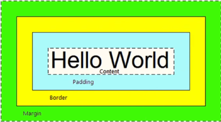
(3)盒子内容的宽高
- width
- height
.box {
  width: 100px;
  height: 100px;
}
6.8、边框 border
/* 粗细 线条样式 颜色(不分先后顺序)*/
/* 默认4个方向都有*/
border: 10px solid red;

/* 单个方向 */
border-top: 10px solid red;
border-bottom: 10px solid red;
border-left: 10px solid red;
border-right: 10px solid red;

/* 单个属性 */
border-width: 边框粗细
border-style: 边框样式
border-color: 边框颜色
线条可选样式
solid 实线
dashed 虚线
dotted 点线
布局顺序:从外到内,从上到下
6.9、内边距 padding
/* 可取 4 个值、3 个值、2 个值、1 个值 */
padding: 上 右 下 左;
padding: 上 左右 下;
padding: 上下 左右;
padding: 上下左右;

/* 单个方向 */
padding-top: 10px;
padding-bottom: 10px;
padding-left: 10px;
padding-right: 10px;
规律:顺时针,值不够看对边
6.10、练习:导航实例
注意:可以使用padding替代width
<style>
    .box {
        border-top: 3px solid #ff8500;
        border-bottom: #edeef0;
    }

    .box a {
        /* 先写盒子大小 */
        display: inline-block;
        /*不使用宽度使用padding防止文本内容太多而大于width*/
        /*width: 80px;*/
        height: 40px;
        padding:0 16px;

        /* 推荐先写上背景,便于查看盒子大小 */
        /* background-color: #edeef0; */

        /* 再写文字样式 */
        line-height: 40px;
        text-align: center;
        color: #4c4c4c;
        font-size: 12px;
        text-decoration: none;
    }

    /* 鼠标悬停效果 */
    .box a:hover {
        background-color: #edeef0;
        color: #ff8044;
    }
</style>

<div class="box">
    <a href="#">首页</a>
    <a href="#">文章</a>
    <a href="#">分类</a>
    <a href="#">标签</a>
</div>
6.11、盒子尺寸计算
给盒子设置border或padding时,盒子会被撑大,不想盒子撑大的方法:
①手动内减:
自己计算多余大小,手动在content中减去
缺点:项目中计算量太大,很麻烦
②自动内减:(内减模式)
给盒子设置 box-sizing: border-box; 即可
优点:浏览器自动计算多余大小,自动在内容中减去
box-sizing: content-box 默认
盒子最终宽度 = width(content) + padding + border
box-sizing: border-box
盒子最终宽度 = width = padding + border + content
适用于inline-block,block
6.12、外边距 margin
设置值的方式和 padding 类似
/* 可取 4 个值、3 个值、2 个值、1 个值 */
margin: 上 右 下 左;
margin: 上 左右 下;
margin: 上下 左右;
margin: 上下左右;

/* 单个方向 */
margin-top: 10px;
margin-bottom: 10px;
margin-left: 10px;
margin-right: 10px;
使用 margin 让元素居中
.box {
  width: 100px;
  height: 100px;
  background-color: #ccc;
  margin: 0 auto;
}
6.13、清除浏览器默认样式
浏览器会默认给部分标签设置默认的margin和padding,但一般在项目开始前要先清除这些默认的margin和padding,后续自己设置
(比如:body有margin:8px、p有margin,ul有margin和padding)
京东
* {
  margin: 0;
  padding: 0;
}
淘宝
blockquote,body,button,dd,dl,dt,fieldset,form,h1,h2,h3,h4,h5,h6,hr,input,legend,li,ol,p,pre,td,textarea,th,ul {
  margin: 0;
  padding: 0;
}
常用的清除样式
* {
  margin: 0;
  padding: 0;
  box-sizing: border-box;
}
去掉列表前的符号
ul {
  list-style: none;
}
版心居中
div {
    width: 1000px;
    height: 300px;
    background-color: pink;
    margin: 0 auto;
}

<div>版心</div>
6.14、外边距折叠现象
- 合并现象
- 塌陷现象
(1)合并现象
- 场景:垂直布局的块级元素,上下的 margin 会合并
- 结果:最终两者距离为 margin 的最大值
- 解决方法:只给其中一个盒子设置 margin
下面代码div间隔只有100px
<style>
    .box-1 {
        width: 100px;
        height: 100px;
        background-color: #698e6a;
        margin-bottom: 50px;
    }

    .box-2 {
        margin-top: 100px;
        width: 100px;
        height: 100px;
        background-color: #7f9faf;
    }
</style>

<div class="box-1"></div>
<div class="box-2"></div>
(2)塌陷现象
- 场景:相互嵌套的块级元素,子元素的 margin-top 会作用在父元素上
- 结果:导致父元素一起往下移动
- 解决方法:
- 给父元素设置 border-top 或者 padding-top(分隔父子元素的 margin-top)
- 给父元素设置 overflow:hidden
- 转换为 行内块元素
- 设置浮动
<style>
    .box-father {
        width: 200px;
        height: 200px;
        background-color: #b2b6b6;
    }

    .box-child {
        width: 100px;
        height: 100px;
        background-color: #7f9faf;
        margin-top: 100px;
    }

    .resolve {
        overflow: hidden;
        margin-top: 20px;
    }
</style>

<div class="box-wrap">
    <!-- 元素的margin-top 作用在了父元素上 -->
    <div class="box-father">
        <div class="box-child"></div>
    </div>

    <!-- [完美解决方案]给父元素设置 overflow:hidden; -->
    <div class="box-father resolve">
        <div class="box-child"></div>
    </div>

</div>
6.15、行内标签的 margin/pading
行内标签的 margin/pading 垂直方向不生效,使用行高 line-height 实现
<style>
    .box {
        border: 1px solid #eee;
    }

    .box span {
        margin: 20px;
        padding: 20px;
    }
</style>

<div class="box">
    <span> hello </span>
</div>
7、CSS 特性
- 继承性
- 层叠性
- 优先级
7.1、继承性 inherited
(1)子元素有默认继承父元素样式的特点
可继承的常见属性(文字属性都可以继承,非文字属性不能继承):
color font-style font-weight font-size font-family text-align text-indent
line-height
(2)继承失效的特殊情况
如果元素有浏览器默认样式,就不继承父元素属性:
a 标签的 color 会继承时效
h 系列标签的 font-size 会继承失效
示例 :
body{
	font: 12px/1.5 微软雅黑
}
给body赋值,子元素也会别继承
若子元素有属性(h,a)用子元素的
7.2、层叠性
同一个标签设置不同的样式
样式层叠叠加,共同作用在标签上
同一个标签设置相同的样式
样式会层叠覆盖,最终写在最后的样式生效
当样式冲突时,只有当选择器优先级相同时,才能通过层叠性判断结果
技巧: 编辑器多行输入
示例 :
<style>
    .color--red {
        color: red;
    }

    /* 绿色的定义位置在红色之后,结果为绿色 */
    .color--green {
        color: green;
    }

    .font-size--20 {
        font-size: 20px;
    }
</style>

<div class="color--green color--red font-size--20">
    君不见黄河之水天上来,奔流到海不复回。
</div>
7.3、优先级
不同选择器具有不同的优先级,
优先级高的选择器样式会覆盖优先级低的选择器
7.3.1、优先级公式(由低到高)
继承
通配符选择器
标签选择器
类选择器
id 选择器
行内样式(style="")
!important(慎重使用)
总结:选择范围越小,优先级越高
!important使用示例
注:!important 不要给继承的添加,自己有样式无法继承父级样式
div{
    color: green !important;
}
7.3.2、复合选择器权重叠加
如果是符合选择器,此时需要通过权重叠加计算方法,判断最终哪个选择器优先级最高会生效

计算公式,每级之间不进位
(0, 0, 0, 0)

(行内, ID, 类, 标签)
第一级 行内样式个数
第二级 id 选择器个数
第三级 类选择器个数
第四级 标签选择器个数
继承最低
需要注意:
!important 权重最高
继承权重最低
chrome 调试: 元素右键 -> 检查元素
工具:PxCook https://www.fancynode.com.cn/pxcook (像素大厨)
示例 :
<style>
    /* (行内,id, 类,标签) */
    /* (0, 2, 0, 0) */
    #father #son {
        color: blue;
    }

    /* (0, 1, 1, 1) */
    #father p.c2 {
        color: black;
    }

    /* (0, 0, 2, 2) */
    div.c1 p.c2 {
        color: red;
    }

    /* 继承 */
    #father {
        color: green !important;
    }

    /* 继承 */
    div#father.c1 {
        color: yellow;
    }
</style>

<div id="father"
     class="c1">
    <p id="son"
       class="c2">hello</p>
</div>
7.4、常见问题
熟练掌握chrome调试工具
css语法出错后,后面的css样式都不执行
8、CSS 浮动
8.1、标准流
标准流:又称为文档流,浏览器排列元素的规则
常见标准流的排版规则
- 块级元素:从上往下,垂直布局,独占一行
- 行内元素或行内块元素:从左往右,水平布局,空间不够自动折行
浏览器解析 行内元素 或 行内块元素 换行书写会产生一个空格
但在书写是,转行内块后不可能全书写在一列上,因此需要浮动
8.2、浮动
浮动的作用:
- 早期:图文环绕
- 现在:网页布局
/*fll flr*/
float: left/right;
fll、flr
浮动的特点:
浮动的标签默认顶对齐(相较于父标签),可使用 margin-top 修改距离顶部距离
浮动元素会脱离标准流(脱标),在标准流中不占用位置(飘到空中)
浮动元素比标准流高半个级别,可以覆盖标准流中的元素(盖不住文字)
浮动找浮动,下一个浮动元素会在上一个浮动元素后面,左右浮动
浮动标签具备行内块特点:
- 一行显示多个
- 可设置宽高
浮动之后盒子水平居中不生效 margin: 0 auto;
示例:
<style>
    /* 初始化样式 */
    * {
        margin: 0;
        padding: 0;
    }

    /* 清除list圆点样式 */
    ul li {
        list-style: none;
    }

    /* 外层容器 */
    .box {
        width: 1200px;
        height: 620px;
        background-color: #ccc;
        margin: 0 auto;
    }

    /* 左边 */
    .left {
        float: left;
        width: 400px;
        height: 620px;
        background-color: pink;
    }

    /* 右边 */
    .right {
        float: right;
        /* background-color: green; */
        height: 620px;
        width: 780px;
    }

    ul li {
        float: left;
        height: 300px;
        width: 180px;
        background-color: skyblue;
        margin-bottom: 20px;
        margin-left: 20px;
    }

    /* 第1个子元素和第5个子元素 */
    ul li:nth-child(4n + 1) {
        margin-left: 0;
    }
</style>

<div class="box">
    <div class="left"></div>
    <div class="right">
        <ul>
            <li></li>
            <li></li>
            <li></li>
            <li></li>
            <li></li>
            <li></li>
            <li></li>
            <li></li>
        </ul>
    </div>
</div>
CSS 书写顺序
- 浮动 / display
- 盒子模型 margin border padding 宽度高度背景色
- 文字样式
常用 css
- 内减模式:box-sizing: border-box;
- 版心居中: margin: 0 auto;
8.3、清除浮动
清除浮动给别的元素带来的影响
影响:如果子元素浮动了,此时子元素不能撑开标准流的块级父元素(父子级标签,父级没有设置高度,后面的标准流盒子会受影响)
清除浮动的方法
8.3.1、直接设置父元素高度(不用)
缺点:太麻烦
8.3.2、额外标签(有缺点)
- 在父元素css内容的最后添加一个块级元素
- 给添加的块级元素设置 clear:both;
缺点:需要额外加标签
.clearfix {
    /*清除左右两侧浮动的影响*/
  clear: both;
}

<div class="top">
	<div class="left"></div>
	<div class="right"></div>
	<div class="clearfix"></div>
</div>
8.3.3、单伪元素清除法
用伪元素替代了额外标签
优点:直接给标签加类即可清除浮动
(1)基本写法
/*单伪元素清除浮动*/
.clearfix::after {
  content: '';
  display: block; /*微元素添加的是行内,要求块*/
  clear: both;
}

/*父元素有两个类名*/
<div class="top clearfix">
	<div class="left"></div>
	<div class="right"></div>
	<div class="clearfix"></div>
</div>
<div class="bottom"></div>
(2)补充写法
.clearfix::after {
  content: '';
  display: block;
  clear: both;

  /* 兼容低版本IE */
  height: 0;
  visibility: hidden;
}
8.3.4、双伪元素清除法(常用)
/* 解决外边距塌陷问题(父子级标签都是块,子级加margin影响父级的位置) */
.clearfix::before,
.clearfix::after {
  content: '';
  display: table; /*转成表格的显示模式(不是块级)*/
}

.clearfix::after {
  clear: both;
}

<div class="top clearfix">
	<div class="left"></div>
	<div class="right"></div>
	<div class="clearfix"></div>
</div>
<div class="bottom"></div>
8.3.5、父元素设置overflow
直接给父元素设置overflow:hidden
优点:方便
.top{
    overflow: hidden
}

<div class="top clearfix">
	<div class="left"></div>
	<div class="right"></div>
	<div class="clearfix"></div>
</div>
<div class="bottom"></div>
9、Flex 布局
9.1、Flex 布局介绍
Flex布局也叫弹性布局,是浏览器提倡的布局模型,非常适合结构化布局,提供了强大的空间分布和对齐能力。
Flex模型不会产生浮动布局中脱标现象,布局网页更简单灵活
9.2、Flex 组成
设置方式:给 父 元素设置 display: flex ,子 元素可以自动挤压或拉伸
父级:弹性容器
子级:弹性盒子
组成部分:
弹性容器
弹性盒子
主轴:默认在水平方向
侧抽/交叉轴:默认在垂直方向
<style>
    /*弹性容器*/
    .box {
        display: flex;
        height: 300px;
        width: 800px;
        border: 1px solid black;
    }
    /*弹性盒子,沿着主轴方向排列*/
    .box div {
        width: 200px;
        /* height: 100px; */
        background-color: yellowgreen;
    }
</style>
9.3、主轴对齐方式
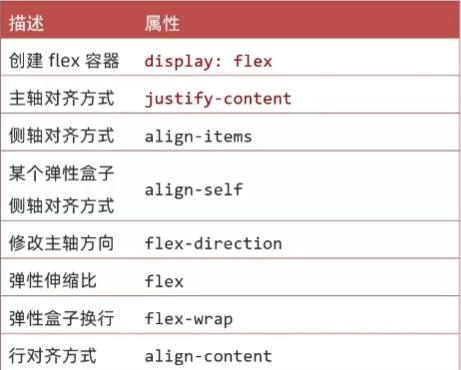
属性名:justify-content:
| 属性值 | 效果 |
|---|---|
| flex-start | 默认值,弹性盒子从起点开始依此排列 |
| flex-end | 弹性盒子终点开始一次排列 |
| center | 弹性盒子沿主轴居中排列 |
| space-between | 弹性盒子沿主轴均匀排列,间距均分盒子之间 |
| space-around | 弹性盒子沿主轴均匀排列,间距均分盒子两侧 |
| spce-evenly | 弹性盒子沿主轴均匀排列,弹性盒子与容器之间间距相等 |
<style>
    /*弹性容器*/
    .box {
        display: flex;

        /*居中*/
        justify-content: center;
        /*父级剩余的尺寸分配成间距,盒子间间距相等*/
        justify-content: space-between;
        /*间距在盒子两侧(弹性盒子之间的间距是两端的两倍)*/
        justify-content: space-around;
        /*哥哥间距都相等*/
        justify-content: space-around;

        height: 300px;
        width: 800px;
        border: 1px solid black;
    }
    /*弹性盒子,沿着主轴方向排列*/
    .box div {
        width: 200px;
        height: 100px;
        background-color: yellowgreen;
    }
</style>

<div class="box">
    <div>1</div>
    <div>2</div>
    <div>3</div>
</div>
9.4、侧轴对齐方式
属性名:
align-items:当前弹性容器内所有弹性盒子对齐方式(给弹性容器设置)
align-self:单独控制某个弹性盒子的侧轴对齐方式(给弹性盒子设置)
| 属性值 | 效果 |
|---|---|
| stretch | 弹性盒子沿侧轴线被拉伸至铺满容器(弹性盒子无高度则默认拉伸,有高度不生效) |
| center | 弹性盒子沿侧轴居中排列 |
| flex-start | 弹性盒子从起点开始依此排列 |
| flex-end | 弹性盒子从终点开始依此排列 |
    <style>
        /*弹性容器*/
        .box {
            display: flex;
            /*弹性盒子侧轴没有方向才拉伸*/
            align-items: stretch;


            height: 300px;
            width: 800px;
            border: 1px solid black;
        }

        /*第二个盒子侧轴居中对齐*/
        .box div:nth-child(2) {
            align-self: center;
        }
    </style>
9.5、修改主轴方向
主轴默认水平方向,侧轴默认垂直方向
属性名:flex-direction
属性值:
| 属性值 | 效果 |
|---|---|
| row | 水平方向,从左向右(默认) |
| column | 垂直方向,从上向下 |
| row-reverse | 水平方向,从右往左 |
| column-reverse | 垂直方向,从上向下 |
<style>
.box {
    display: flex;

    /*修改主轴方向 垂直方向:侧轴自动变换到水平方向*/
    flex-direction: column;

    /*主轴为垂直方向,垂直居中*/
    justify-content: center;

    /*侧轴在水平,水平居中*/
    align-items: center;


    height: 300px;
    width: 800px;
    border: 1px solid black;
}
</style>
9.6、弹性伸缩比
默认情况下,主轴方向的尺寸是靠内容撑开,侧轴默认是拉伸的效果
作用:控制弹性盒子的 主轴 方向的 尺寸
属性名:flex
属性值:整数数字,表示占用父级剩余尺寸的份数
<style>
    /*弹性容器*/
    .box {
        display: flex;
        height: 300px;
        border: 1px solid black;
    }

    /*弹性盒子,沿着主轴方向排列*/
    .box div {
        /* height: 100px; */
        background-color: yellowgreen;
    }

    .box div:nth-child(1) {
        width: 200px;
    }

    .box div:nth-child(2) {
        flex: 1;
    }
    .box div:nth-child(3) {
        flex: 2;
    }
</style>
9.7、弹性盒子换行
弹性盒子可以自动挤压或拉伸,默认情况下,所有弹性盒子在一行显示
属性名:flex-wrap
属性值:
wrap:换行
nowrap:不换行(默认值)
<style>
    .box {
        display: flex;
        flex-wrap: wrap;
        height: 300px;
        width: 500px;
        border: 1px solid black;
    }

    .box div {
        height: 100px;
        width: 200px;
        background-color: yellowgreen;
    }
</style>
9.8、行对齐方式
属性名:align-content
属性值:(与主轴对齐方式相同)
| 属性值 | 效果 |
|---|---|
| flex-start | 默认值,弹性盒子从起点开始依此排列 |
| flex-end | 弹性盒子终点开始一次排列 |
| center | 弹性盒子沿主轴居中排列 |
| space-between | 弹性盒子沿主轴均匀排列,间距均分盒子之间 |
| space-around | 弹性盒子沿主轴均匀排列,间距均分盒子两侧 |
| spce-evenly | 弹性盒子沿主轴均匀排列,弹性盒子与容器之间间距相等 |
<style>
    .box {
        display: flex;
        flex-wrap: wrap;
        justify-content: center;
        align-content: center;
        height: 300px;
        width: 500px;
        border: 1px solid black;
    }
</style>
注:align-content 对单行弹性盒子不生效
10、CSS 定位
10.1、网页常见布局方式
1、标准流:
块级元素独占一行 -> 垂直布局
行内元素/行内块元素一行显示多个 -> 水平布局
2、浮动
原本垂直布局的块级元素变成水平布局
3、定位
可以让元素自由的摆放在网页的任意位置
一般用于盒子之间的层叠情况
让盒子固定在页面某一位置
10.2、使用定位的步骤
1、设置定位方式
属性名: position
| 定位方式 | 属性值 |
|---|---|
| 静态定位 | static(默认,不定为,就是文档流) |
| 相对定位 | relative |
| 绝对定位 | absolute |
| 固定定位 | fixed |
2、设置偏移值
偏移值可以设置水平和垂直方向
选取原则:就近原则

10.3、相对定位
- 相对于自己之前的位置
- 占有原来的位置(原来处在的位置不会被填充)
- 不改变显示模式(块还是块)
position: relative /*Emment:por*/
left: 100px;
top: 100px;
Tips: 如果 4 个定位都有,以 top 和 left 为准
相对定位只加position,还是原来的位置
10.4、绝对定位
绝对定位:
先找已经定位的父级,如果有这样的父级就以这个父级为参照物进行定位
有父级,但父级没有定位,以浏览器窗口为参照进行定位
- 相对于非静态定位的父元素定位
- 脱标,不占有原来的位置
- 改变显示模式(行内块特点,行内共存,宽高生效)
- 默认以浏览器 body 定位
position: absolute /*Emment:psa*/
left: 100px;
top: 100px;- 子绝父相:父级相对定位,子级绝对定位
- 绝对定位查找父级的方法:逐级向上,最终是浏览器窗口
1绝对定位的盒子不能使用margin 0 auto居中
解决方式:
① 手动修改(耦合性高)
.box {
    position: absolute;
    left: 50%;
    margin-eft: -150px; /*减去宽的一半*/
    width: 300px;
    height: 300px;
}

<div class="box"></div>
②位移 transform(常用)
.box{
    position: absolute;
    left: 50%;
    top: 50%
	/*位移,自己宽度,高度的一半*/
	transform: translate(-50%,-50%)
}
10.5、固定定位
fixed
positions: fixed;特点:
- 脱标-不占位置
- 相对于浏览器定位
- 具备行内块特点
10.6、元素层级关系
- 不同布局方式元素的层级关系:
标准流 < 浮动 < 定位- 同层级,后写的会覆盖在先写的元素
- 设置元素层级
z-index
/* 默认值0;数值越大,显示越靠前 */
z-index: 数值;
11、CSS 装饰
11.1. 垂直对齐 vertical-align
基线(baseline):浏览器文字类型元素排版中存在用于对齐的基线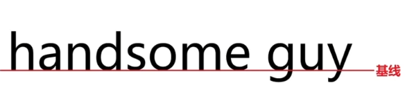
| 属性值 | 效果 |
|---|---|
| baseline | 默认,基线对齐 |
| top | 顶部对齐 |
| middle | 中部对齐 |
| bottom | 底部对齐 |
vertical-align: middle;处理行内块和文字对齐,或行内块和行内块对齐都用 vertical-align: middle; |
浏览器把行内和行内块当做文字处理,文字默认基线对齐(有时可以改为块状元素解决问题)
示例一:输入框垂直居中对齐
<style>
    input {
        height: 50px;
    }
    input[type="button"] {
        height: 30px;
    }
    .middle input {
        vertical-align: middle;
    }
</style>

<div>
    <input type="text" />
    <input type="button"
           value="搜索" />
</div>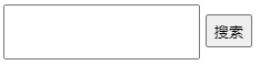
示例二:图片垂直居中对齐
<style>
    .middle-box {
        margin-top: 20px;
    }
    .middle-box img {
        vertical-align: middle;
    }
</style>

<div>
    <div class="box middle-box">
        <img src="XXX.jpg" /><input type="button" value="搜索" />
    </div>
</div>
示例三:图片水平垂直居中
<style>
    .box {
        width: 400px;
        height: 400px;
        background-color: skyblue;
        /* 文字,图片水平居中 */
        text-align: center;
        /*图片垂直居中,但图片不会,需配合vertical-align: middle;*/
        lineheight: 400px;
    }

    img {
        height: 200px;
        width: 200px;

        /* 垂直居中 */
        /*配合text-align: center;*/
        vertical-align: middle;
    }
</style>

<div class="box">
    <img src="XXX.jpg" />
</div>
11.2、cursor
| 属性值 | 效果 |
|---|---|
| default | 默认,箭头 |
| pointer | 小手,提示可点击 |
| text | 工字型,提示可选择 |
| move | 十字光标,提示可移动 |
示例:
<style>
    .cursor--pointer {
        cursor: pointer;
    }

    .cursor--text {
        cursor: text;
    }

    .cursor--move {
        cursor: move;
    }
</style>

<div class="box">
    <div>默认,箭头</div>
    <div class="cursor--pointer">小手,提示可点击</div>
    <div class="cursor--text">工字型,提示可选择</div>
    <div class="cursor--move">十字光标,提示可移动</div>
</div>
11.3、border-radius

/* 单值 4个角一样*/
border-radius: 数字px / 百分比;

/* 多值 左上角开始,顺时针赋值,没有赋值看对角*/
border-radius: 左上 右上 右下 左下;
(1)正圆
- 盒子必须是正方形
- 设置边框圆角为盒子宽高的一半
示例:
<style>
    .box {
        width: 200px;
        height: 200px;
        border-radius: 50%;
        background-color: skyblue;
    }
</style>

<div class="box"></div>
/* 最大值 50% */
border-radius: 50%;(2)胶囊按钮
- 盒子设置为长方形
- 设置边框圆角为高度的一半
border-radius: height/2;示例:
<style>
    .box {
        width: 100px;
        height: 50px;
        border-radius: 25px;
        background-color: skyblue;
    }
</style>

<div class="box"></div>
11.4、 溢出部分效果 overflow
溢出部分:盒子内容部分超出盒子范围的区域
| 属性值 | 效果 |
|---|---|
| visible (ovv) | 默认,溢出部分可见 |
| hidden (ovh) | 溢出部分隐藏 |
| scroll | 无论是否溢出都显示滚动条 |
| auto (ova) | 根据是否溢出,自动显示或隐藏滚动条 |
示例:
<style>
    .box {
        width: 100px;
        height: 100px;
        background-color: skyblue;

        overflow: hidden;
    }
</style>

<div class="box">
    很长的文字
</div>
11.5、 元素本身隐藏
让某个元素本身在屏幕中不可见,如:鼠标:hover之后元素隐藏
常见属性:
1、visibility:hidden (不常用,占位的隐藏)
2、display:none (常用,不占位的隐藏)
示例:默认隐藏,鼠标悬停显示
box鼠标悬停,修改box2的显示模式:.box:hover .box2
<style>
    .box {
        width: 100px;
        height: 100px;
        background-color: skyblue;
        position: relative;
    }

    /*box鼠标悬停,修改box2的显示模式*/
    .box:hover .box2 {
        display: block;
    }

    .box2 {
        position: absolute;
        top: 100px;
        width: 100px;
        height: 100px;
        background-color: pink;
        display: none;
    }
</style>

<div class="box">
    <div class="box5"></div>
</div>
11.6、 opacity
属性值:
0-1 之间的数字;
0 完全透明,1 完全不透明
示例:
<style>
    .box {
        width: 100px;
        height: 100px;
        background-color: skyblue;
        opacity: .5;
    }
</style>

<div class="box"></div>
半透明:rgba(0, 0, 0, 0.5);
11.7、精灵图
将多张小图合并成一张大图,这张大图称为精灵图
优点:减少服务器发送次数,减轻服务器压力,提高页面加载速度
缺点:修改起来比较麻烦
精灵图使用步骤
1、创建一个盒子,设置盒子尺寸和小图尺寸相同
2、将精灵图设置为盒子的背景图片
3、修改背景图位置
一般精灵图的标签都用行内标签
修改背景图片的位置: background-position: 0 0(往左往上给负值)
<style>
    .box {
        background-image: url('./img/jd-sprite.png');
        background-repeat: no-repeat;
        background-size: 113px 86.5px;
        width: 36px;
        height: 42px;
        display: inline-block;
        margin-right: 50px;
    }

    .box-1 {
        /*改变背景图位置*/
        background-position: 0 0;
    }

    .box-2 {
        background-position: -38.5px 0;
    }

    .box-3 {
        background-position: -77px 0;
    }

    .box-4 {
        background-position: 0 -44.5px;
    }
</style>

<div class="box box-1"></div>
<div class="box box-2"></div>
<div class="box box-3"></div>
<div class="box box-4"></div>
11.8、background-size
background-size: 宽度 高度;| 取值 | 场景 |
|---|---|
| 数字+px | 简单方便,常用 |
| 百分比 | 相对于当前盒子自身的宽高百分比 |
| contain | 包含,背景图等比缩放,直到不会超出盒子的最大,可能有留白 |
| cover | 覆盖,背景图等比缩放,直到刚好填满整个盒子没有空白,图片可能显示不全 |
background连写拓展:
background: color image repeat position/size;11.9、盒子阴影 box-shadow
| 参数 | 作用 |
|---|---|
| h-shadow | 必须,水平偏移量,允许负值 |
| v-shadow | 必须,垂直偏移量,允许负值 |
| blur | 可选,模糊度 |
| spread | 可选,阴影扩大 |
| color | 可选,阴影颜色 |
| inset | 可选,将阴影改为内部阴影 |
<style>
    .box {
        width: 100px;
        height: 100px;
        box-shadow: 0 10px 50px 8px #ccc;
    }
</style>

<div class="box"></div>
注意:外阴影不能添加outside,添加了会导致属性报错
11.10、过渡 transition
transition (trs)
- 让元素样式慢慢变化
- 常配合 hover 使用
transition 属性 时长, 属性 时长;| 参数 | 取值 |
|---|---|
| 过渡属性 | 所有属性 all;具体属性 width... |
| 过渡时长 | 数字 + s(秒) |
注意:
- transition 属性给需要过渡的元素本身加
- transition 属性设置在不同状态中,效果不同
- 给默认状态设置,鼠标移入移出都有过渡效果
- 给 hover 状态设置,鼠标移入有过渡效果,移出没有过渡效果
如果变化的属性多,直接写all,表示所有
<style>
    .box {
        width: 100px;
        height: 100px;
        background-color: skyblue;
        transition: all 2s;
    }

    .box:hover {
        width: 200px;
        background-color: pink;
    }
</style>

<div class="box"></div>
11.11、scroll-behavior
当用户手动导航或者 CSSOM scrolling API 触发滚动操作时,让滚动条丝滑滚动
html {
    scroll-behavior:smooth;
}
12、CSS 常用代码/实战
1、项目结构
根目录:
index.html 首页
css / base.css 基本公共的样式 清除浏览器默认样式
common.css 重复使用样式,网页头与尾
index.css 页面单独的样式
favicon.ico
images/ 固定使用的图片素材
**uploads/ ** 非固定使用的图片素材
2、常用CSS
2.1、base.css 清除默认样式
/* base.css 清除默认样式*/

/*清除常见标签的margin和padding*/
body,
h1,
h2,
h3,
h4,
h5,
h6,
p,
ul,
ol,
li,
dl,
dt,
dd,
input {
  margin: 0;
  padding: 0;
}

/*内减模式*/
* {
  box-sizing: border-box;
}

/*设置网页统一的字体大小,行高,字体系列 */
body {
  font: 16px/1.5 Arial, 'Microsoft Yahei', sans-serif;
  color: #333;
}

/*去除列表默认样式*/
ul,
ol {
  list-style: none;
}

/*去除默认倾斜*/
i,
em {
  font-style: normal;
}

/*去除a标签下划线,并设置默认文字颜色*/
a {
  text-decoration: none;
  color: #333;
}

/*设置img垂直对齐方式为居中对齐,去除默认下间隙*/
img {
  vertical-align: middle;
}

/* 去除input默认样式 */
input {
  border: none;
  outline: none;
  color: #333;
}

/*左浮动*/
.fl {
  float: left;
}
/*右浮动*/
.fr {
  float: right;
}

/*双伪元素清除浮动*/
.clearfix::before,
.clearfix::after {
  content: '';
  display: table;
}

.clearfix::after {
  clear: both;
}
2.2、 common.css 版心
/* 版心居中 */
.wrapper {
  width: 1240px;
  margin: 0 auto;
}

/* 让文字看不见 */
font-size: 0;
2.3、CSS样式引入顺序:
<link rel="stylesheet" href="base.css">
<link rel="stylesheet" href="common.css">
<link rel="stylesheet" href="index.css">
2.4、控制 input placeholder 样式
input::placeholder {
}
2.4、调节图片垂直对齐方式(上下居中)
img {
  vertical-align: middel;
}
2.5、通栏盒子(与浏览器宽度相同的盒子)
/* 占据屏幕整个宽度 */
.box {
  width: 100%;
}
2.6、小圆点
通过ol li增加宽高,设置border-radius:50px
2、骨架标签解读
<!-- 文档类型声明,告诉浏览器是HTML5的版本 -->
<!DOCTYPE html>

<!-- 网页语言,中文zh-CN -->
<html lang="en">
  <!-- 网页字符编码 -->
  <meta charset="UTF-8" />

  <!--浏览器兼容-->
  <meta http-equiv="X-UA-Compatible" content="IE=edge,chrome=1" />

  <!--宽度 = 设备宽度 : 移动端网页的时候需要用-->
  <meta name="viewport" content="width=device-width, initial-scale=1.0">
</html>
3、SEO
SEO
Search Engine Optimization 搜索引擎优化
作用:让网站在搜索引擎上的排名靠前
提升SEO的常见方法:
1、竞价排名
2、将网页制作成 html 后缀
3、标签语义化,适合的地方使用合适的标签
SEO 三大标签
1、title 标题
2、description 描述
3、keywords 关键词,英文逗号分隔
<title>T4mako</title>
<meta name="description" content="Description" />
<meta name="keywords" content="keywords1,keywords2" />
4、icon 图标
favicon.ico 文件放根目录
<!--link:favicon-->
<link rel="shortcut icon" href="favicon.ico" type="image/x-icon" />
5、对齐方式
- vertical-align
- 行高
- 定位
6、常用类名
shortcut /*快捷导航*/
wrapper /*版心*/
header /*头部*/
nav /*导航*/
search /*搜索*/
footer /*版权区域*/
prev /*上一个*/
next /*下一个*/
current/active